Unicef Italy
UX-UI Design / Website

Reshape the best path to inform, raise awareness and raise funds to help children around the world.
Revamping the UNICEF Italy website was a mission to enhance user experience and accessibility. With over 1 million annual visitors seeking information and ways to make a difference, our analysis uncovered complexities in the existing structure. Through extensive conversations and guerrilla interviews, we identified user needs and expectations.
Our redesign journey involved creating a clear information architecture with active input from UNICEF teams. The result: a scalable design system that seamlessly integrates content and effectively communicates UNICEF's mission to inform, raise awareness, and raise funds for children worldwide.
✺ Client
unicef Italy
✺ Date
2020
✺ Design With
Marco Miccichè, Francesca Maio,
Angelo Oldani, Martina Ondei
✺ Design Studio
Avanade Italy
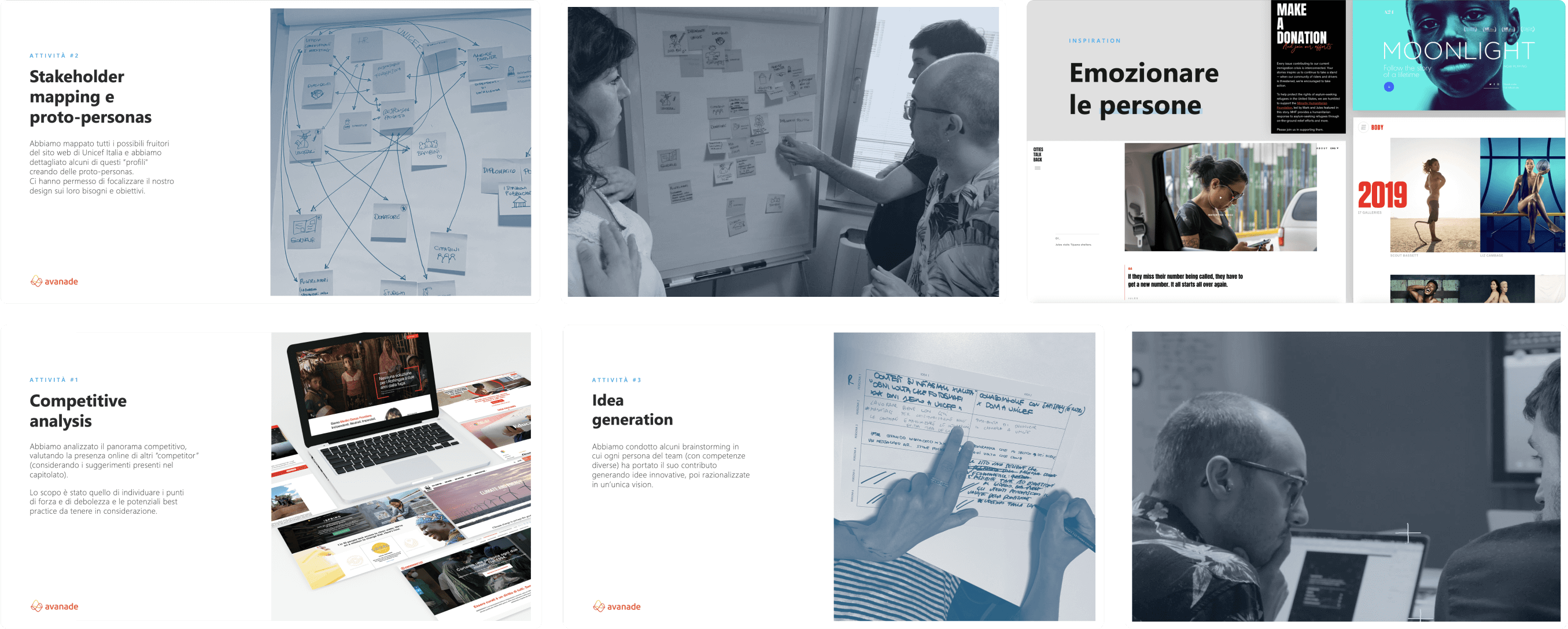
Ideation
Different audiences into a single design vision.
After looking for best practices and trends from the market to build a design vision, we experimented an interview approach that quickly identified the needs and expectations for the different audiences, including donors, volunteers, information seekers, and journalists. Then, we started several intensive ideation and co-design sessions with the internal stakeholder to develop a strongly relationship between the new website and the content needs.
Design Principles
Based on our research results we defined the design principles to keep us on track during all the phases of the project.
• Incentivise
Encourage users to get into stories and contents.
• Engage
Create an emotional relationship with the users.
• Simplify
Design with a modular approach and reusable component.
Interaction model
Central to our concept is the integration of a dynamic information architecture and an interactive model that reshapes the user's journey.
By connecting content seamlessly between pages, users are empowered to delve deeper into each issue. The design facilitates a circular navigation, offering users the opportunity to explore suggested and related content. This interconnected approach not only enhances user engagement but also enriches the overall browsing experience, providing a holistic understanding of the diverse topics presented on the UNICEF Italy website.


Style
Our color palette reflects UNICEF's values, while the IBM Plex™ typography balances nature and engineering, emotion and rationality.


Concept
Each navigation transforms into a unique journey, a blend of information and emotions.
The three key design principles - incentivise, evoke emotion, simplify - shape a compelling digital experience where individuals feel engaged in a network of connections. This approach not only inspires but also streamlines action, encouraging the desire to actively contribute, donate, and become an integral part of UNICEF.

Website
The modular approach of the components allows flexibility, adapting to specific content needs.
Through a series of strategic highlights and an engaging photo slider, the homepage is designed to immerse users in the most relevant contents.
Home Page Slider
Home Page Scrolling
Content pages
The content pages are designed to enhance a journalistic-style storytelling experience.
Through a balance of typography and photography, we've infused a rhythm into the content, making it not only easy to read but also engaging. The strategically placed references to other related content amplify the discovery experience. Furthermore, discreetly integrated donation entry points accompany you throughout the entire reading journey, providing meaningful opportunities for engagement.
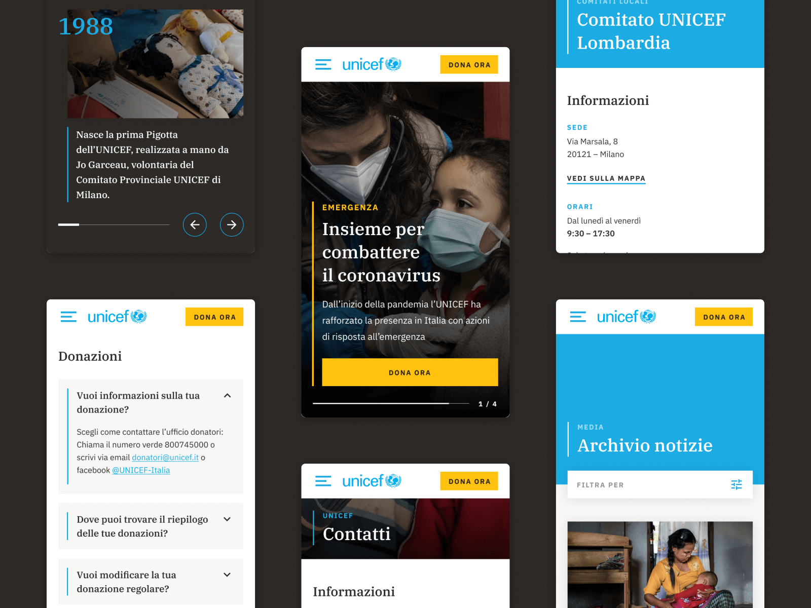
Mobile Experience
Optimizing every component for seamless interaction on various devices.
With a keen focus on widespread smartphone traffic, we've made content, information, and donation triggers easily accessible, encouraging users to take meaningful actions and amplify the positive impact of our platform.

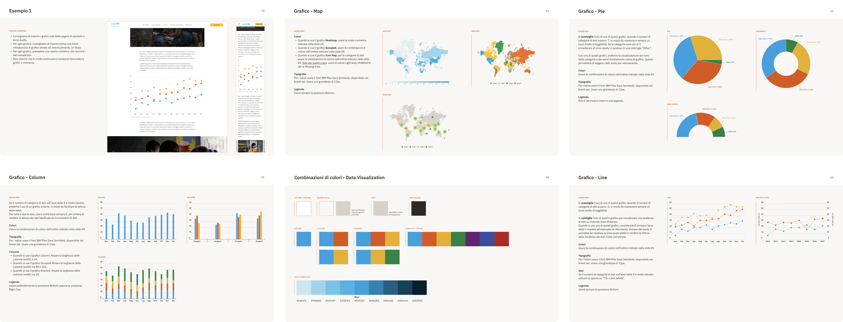
Data visualization
The challenge was balancing the brand identity with creating color palettes for different types of data, and adhering to accessibility requirements.
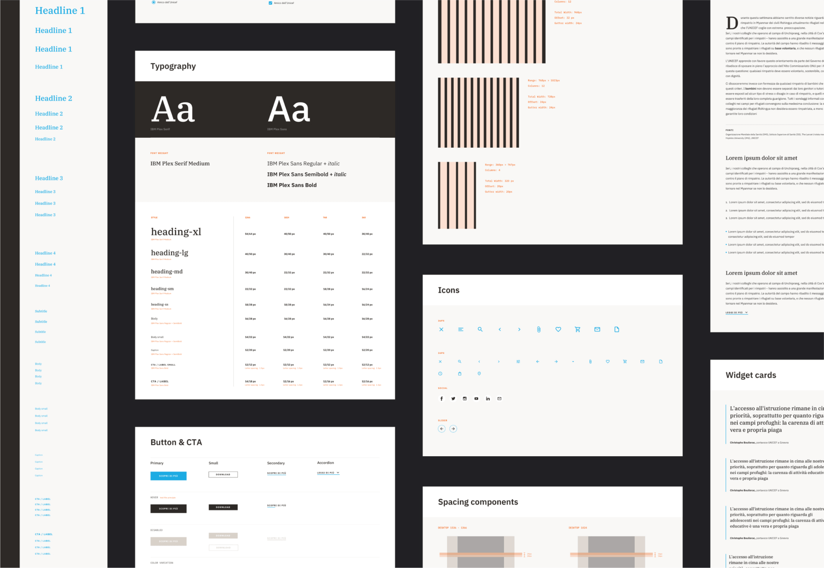
Design System
We meticulously crafted a comprehensive design system utilizing React and Storybook for our website.
Leveraging the power of Storybook allowed us to thoroughly test each component independently before seamlessly integrating them into the CMS. This meticulous approach not only ensured consistency but also streamlined the development process, resulting in a cohesive and efficient user experience.