Switch App
UX-UI Design / Product Design / App
Enable a behaviour change leading people to switch to less harmful anternatives to smokes.
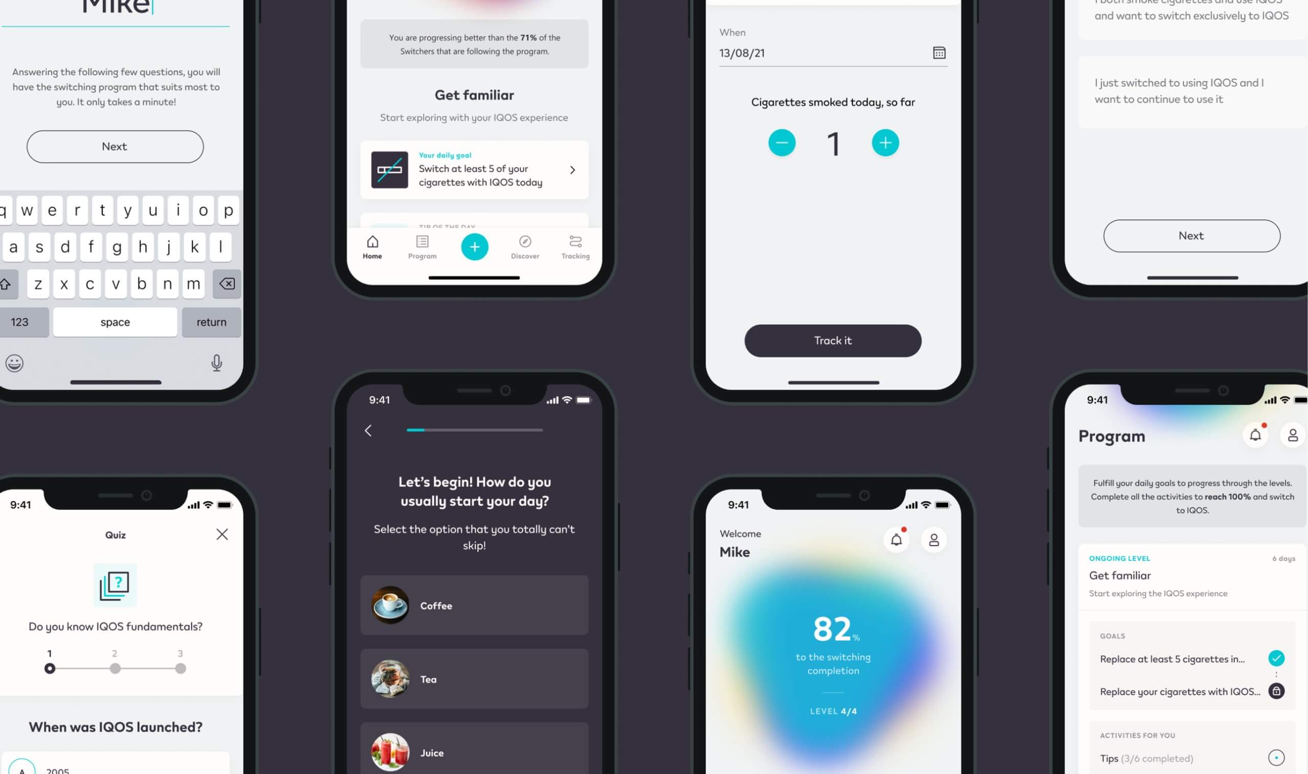
The core of the app is a personalised program, based on each person motivations and needs and able to shape the smoking behaviours.
The program acts as a guidance to replace old habits and routines with new ones, helping to shape automatic processes.
Another important feature is the tracking, so the users are able to record their behaviours and monitor how this is improving their wellbeing and health. Last - but not least - Switch provides educational insights from trustworthy sources, to leverage motivation and knowledge. These insights are available in the form of articles and quizzes.
Everything we do in the project is based on behavioural science. So the solution we are crafting has solid scientific bases.
✺ Client
Philip Morris International
✺ Date
2021
✺ Design With
Angelo Oldani, Roberta Capellini,
Marco Miccichè, Francesco Ghedin
✺ Agency
Accenture Interactive
Research
We were able to identify six behavioral change dimensions to leverage in order to facilitate the substitution of the “unwanted” behaviors.
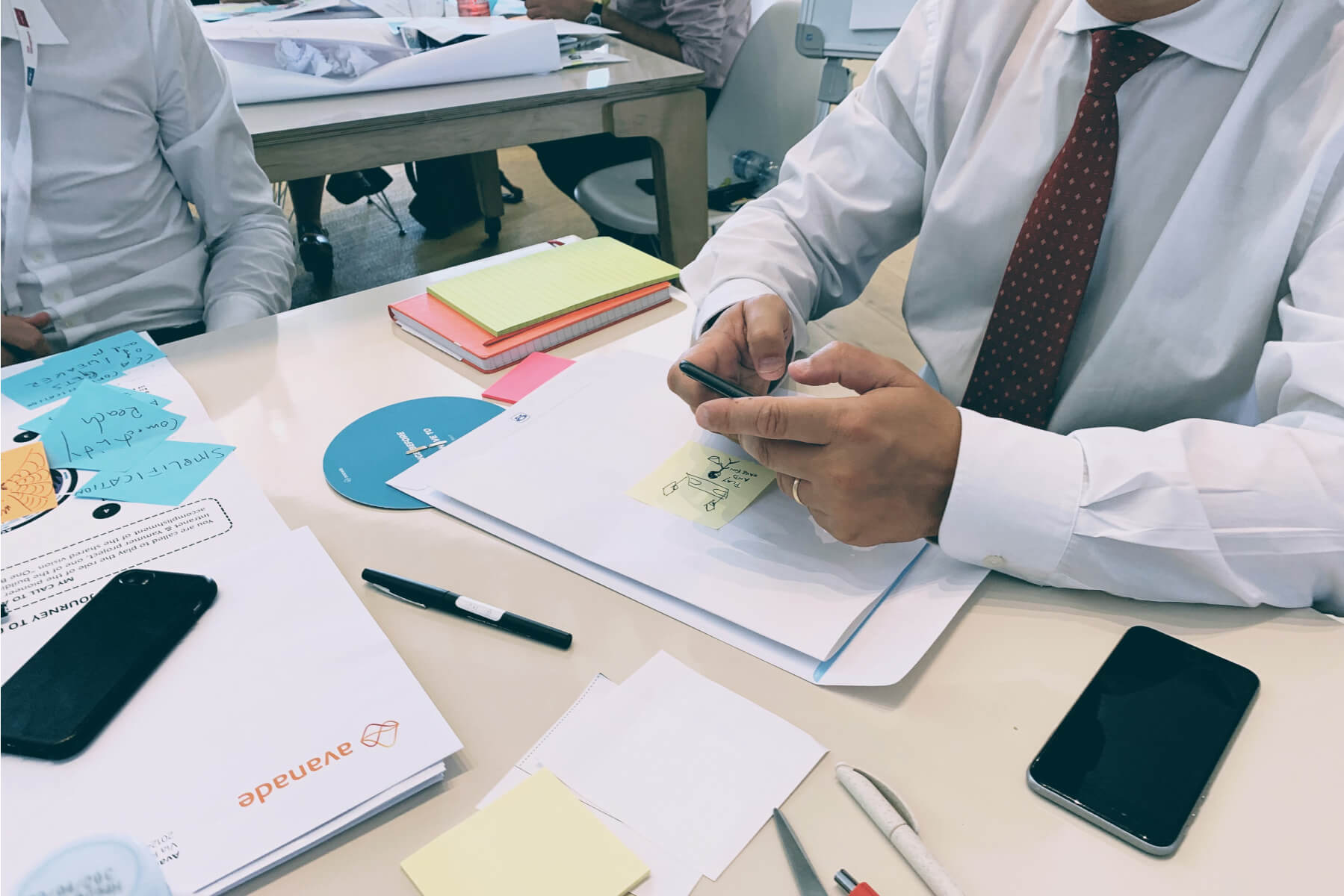
We conducted several focus groups and workshops to gather information directly from consumers and distill our work into a list of implementable features. Each feature was then designed with a series of behavioral change techniques in mind, to ensure the best result possible.
Design Principles
The concept lays on three design principles.
1. Engaging
Switch leads to successful change through engaging activities and captivating content. Switch minimizes the effort required for user input as well as the time requested to complete the tasks.
2. Science-based
Switch provides proven insights from selected and trustworthy sources. Incorporating behavioural science theory, techniques and methodology, Switch gives the user the highest probability of sustained success.
3. Memorable
Details are not just nice to have - they are a fundamental piece of the Switch visual appearance. They are applied selectively, to offer a high-quality, thrilling and unforgettable overall user experience.
interaction Model
Crafting an interaction model to make the user experience intuitive and engaging.
This model, organizing and structuring various areas, provides a key outline of user flow and potential personalized program combinations. The aim is to offer an immersive experience, supporting users in achieving their objectives.
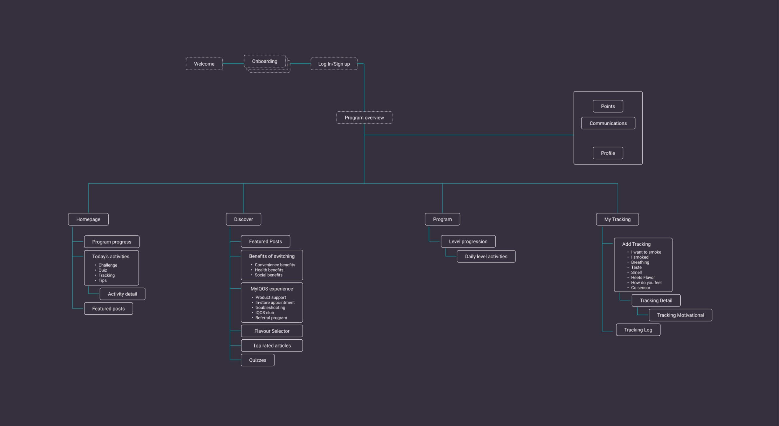
Information architecture
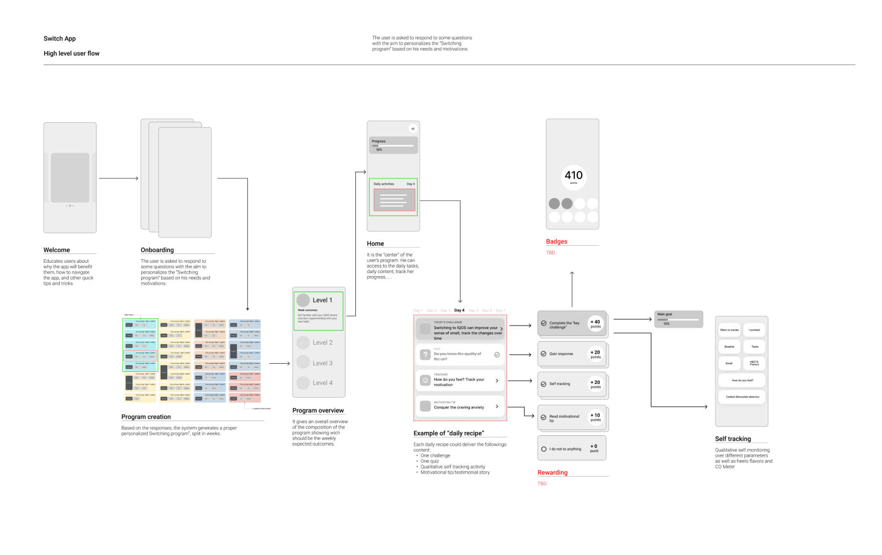
High level user flow
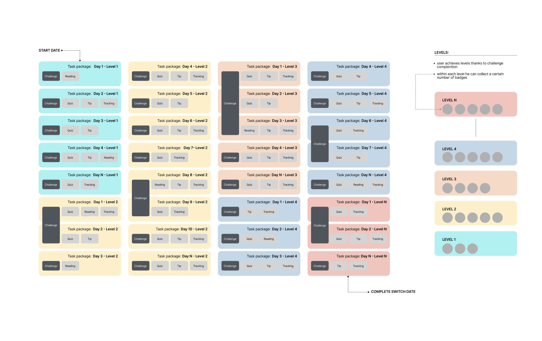
Program model
Visual Concept
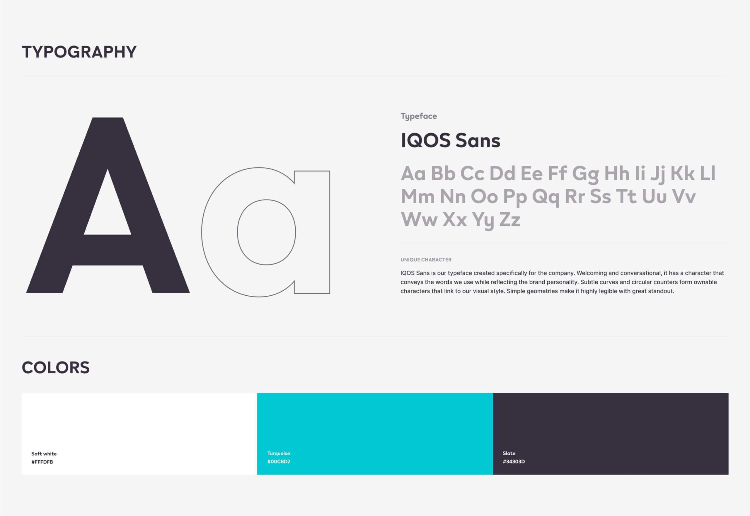
Starting from the brand guidelines we have set the color palette, typography and iconography in order to find the best way to evolve the IQOS brand in our app.
Visual Concept
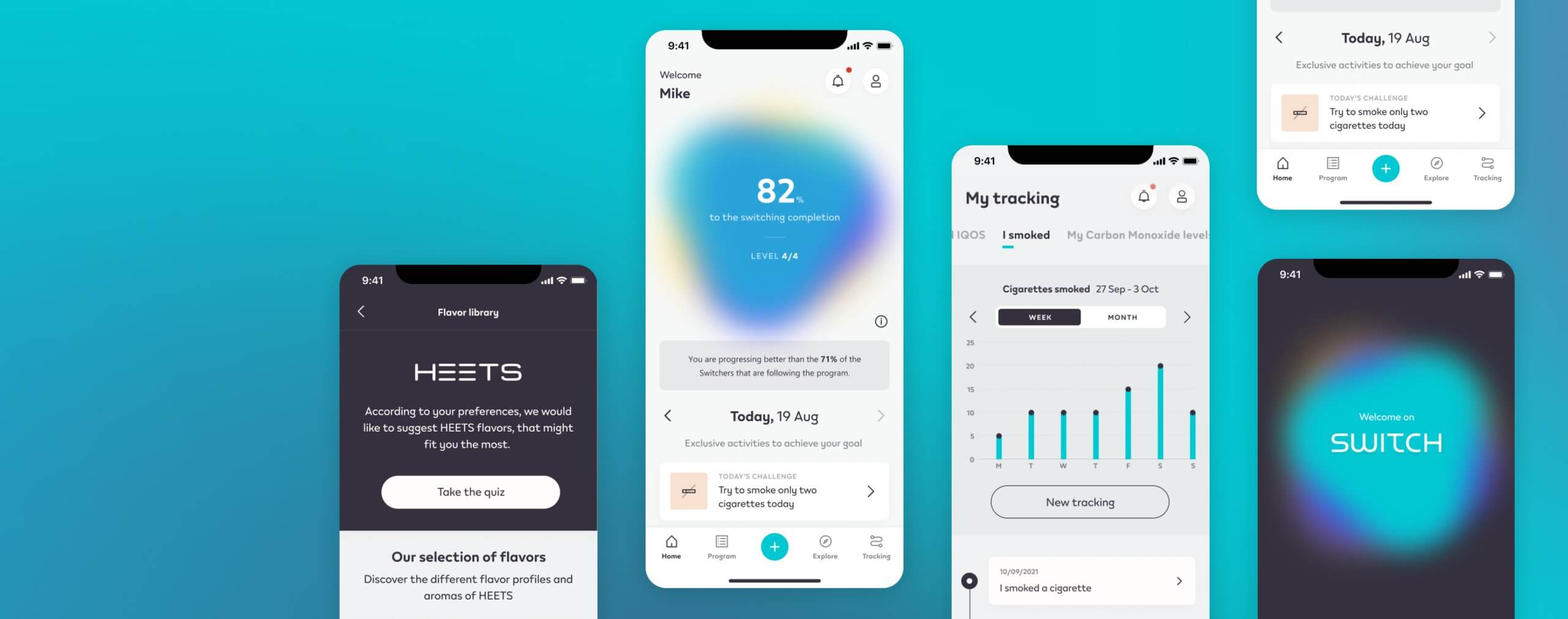
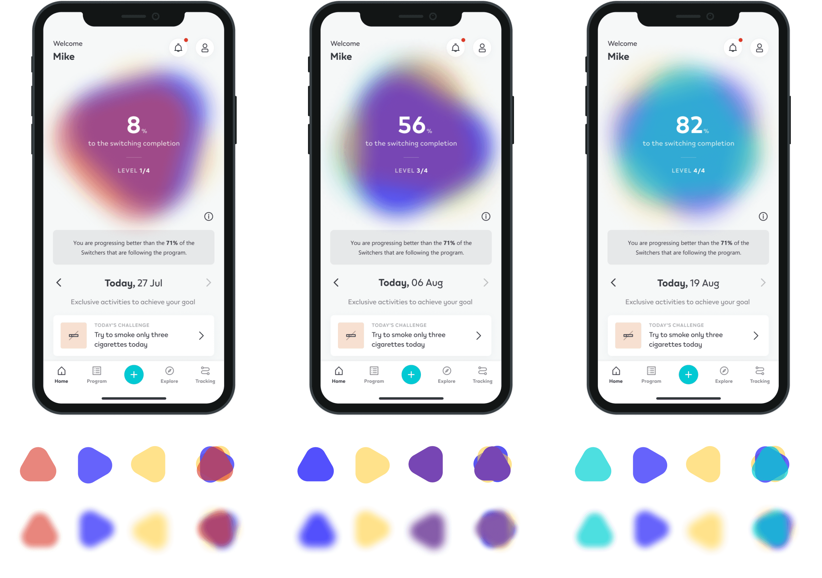
A living organism that changes according to the user’s progress throughout the switch path.
Drawing inspiration from the core shape of the IQOS logo it’s a strong visual element for the brand, but it’s more than this, because our organic shape would also evolve based on the progress of the user's switch journey through a chromatic evolution. This natural evolution of the colour would help the user to not only understand their progress but also create positive emotions as they move towards the peaceful, healthy blue colour ..that is also the color of the brand.
Program set up
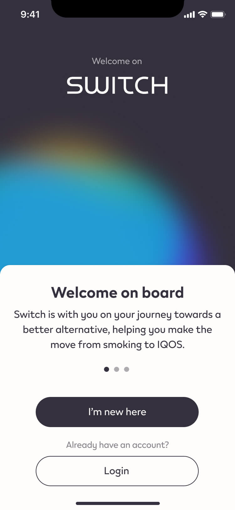
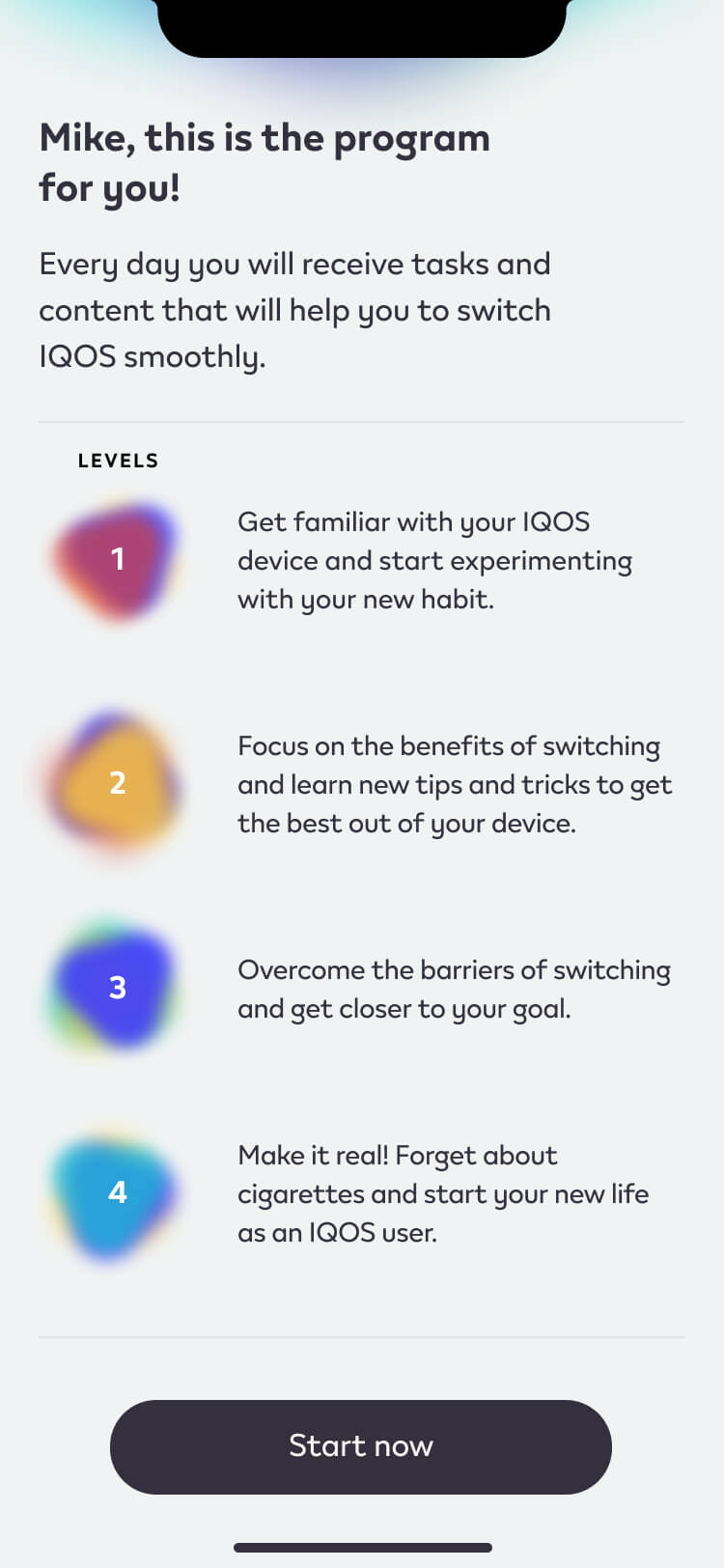
Guiding the Switcher’s toward a plan that brings long-term results.
This step-by-step program definition aims to personalize the "Switching Program" by aligning it with user needs and motivations, guiding Switch users towards achieving enduring results.
Challange
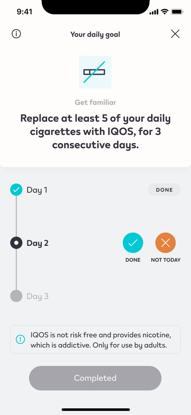
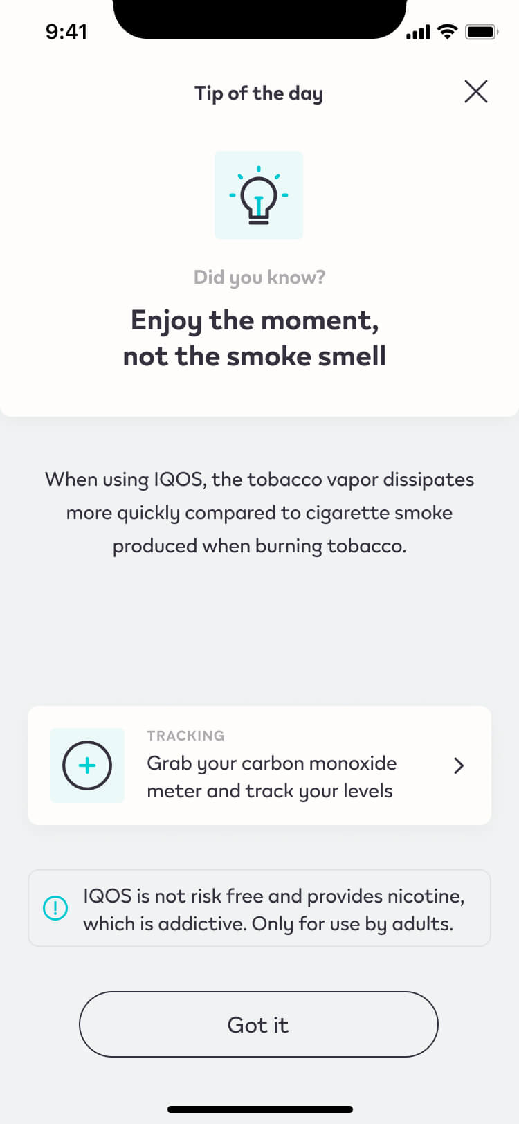
The Daily content accompanying the Switcher with no stress.
The homepage gives access to the daily activity package. Tailor made and enjoyable activities based on behavioural change techniques. Featured content is also spotlighted in the homepage to promotes awareness around certain switching themes.
Discover
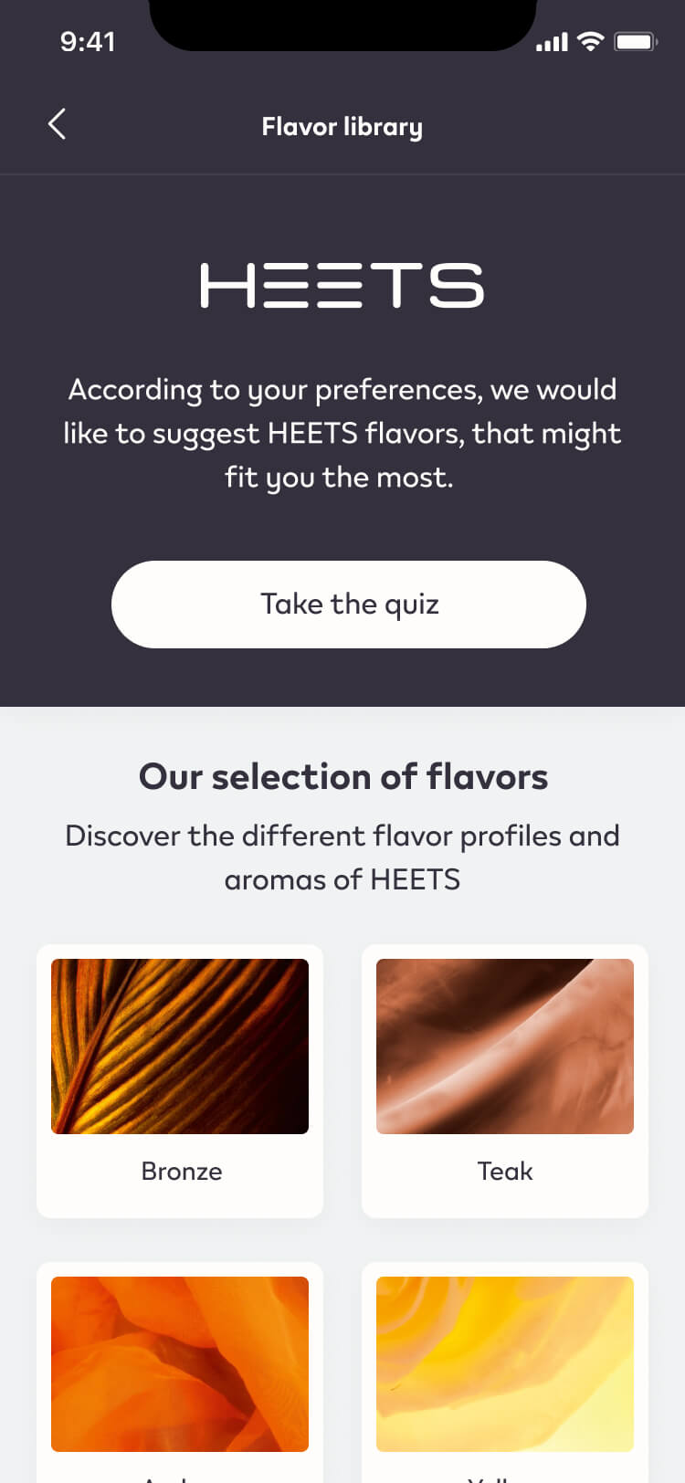
Gathering all the knowledge in a structure place.
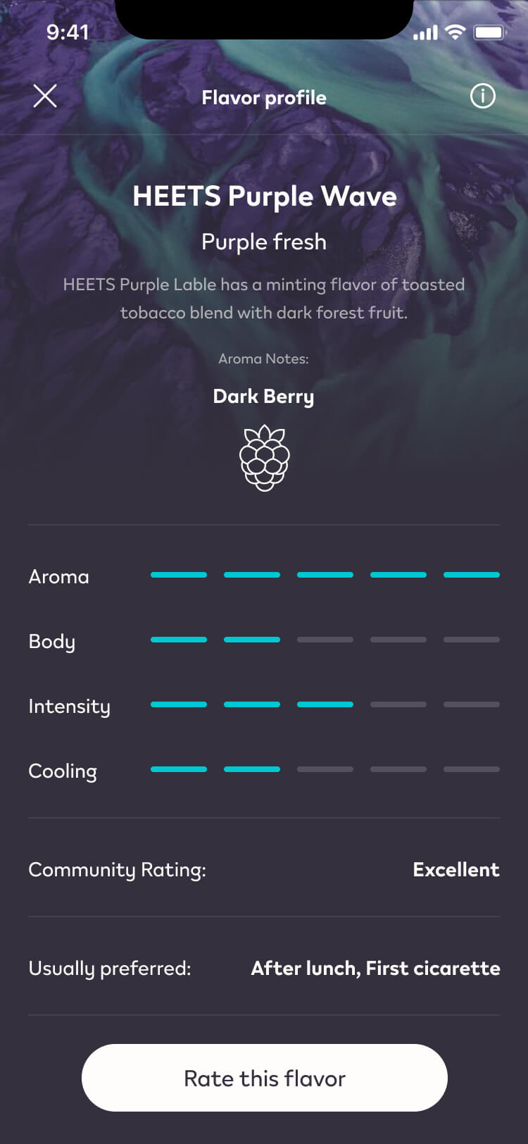
The Discover sections is where Switch provides educational insights from selected and trustworthy sources to convey information on IQOS impact on health and how to use/maintain the devices to get the best experience.
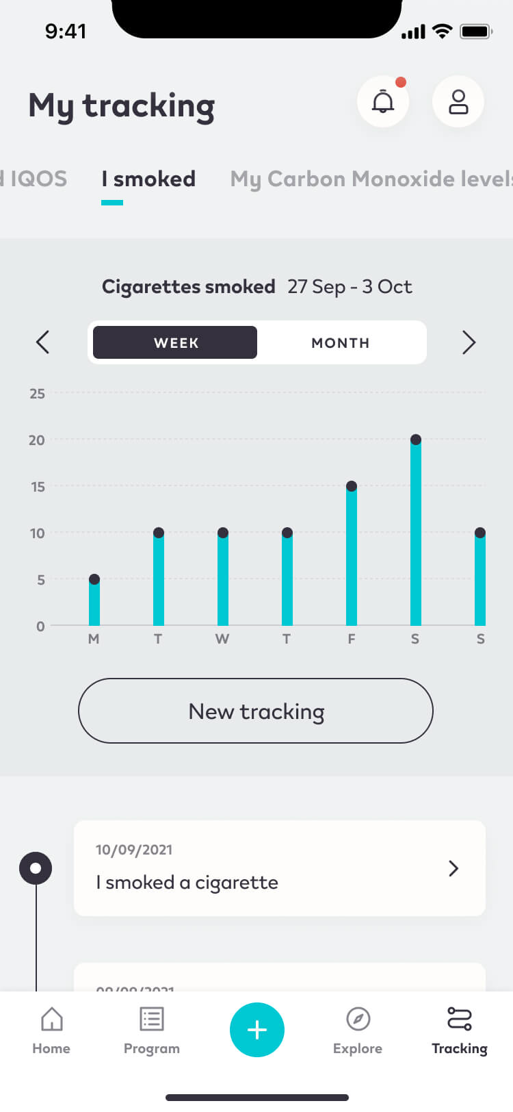
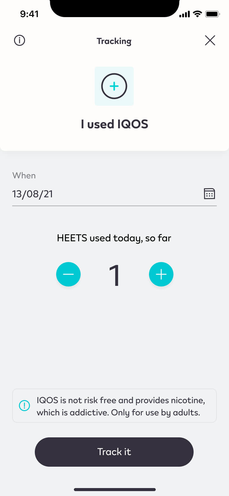
Self Tracking
Effortless Progress Monitoring and Visualization.
The "Self Tracking" feature simplifies the process with just a few taps, enabling users to effortlessly record behaviors and seamlessly visualize their progress in switching, eliminating the need for complex forms.
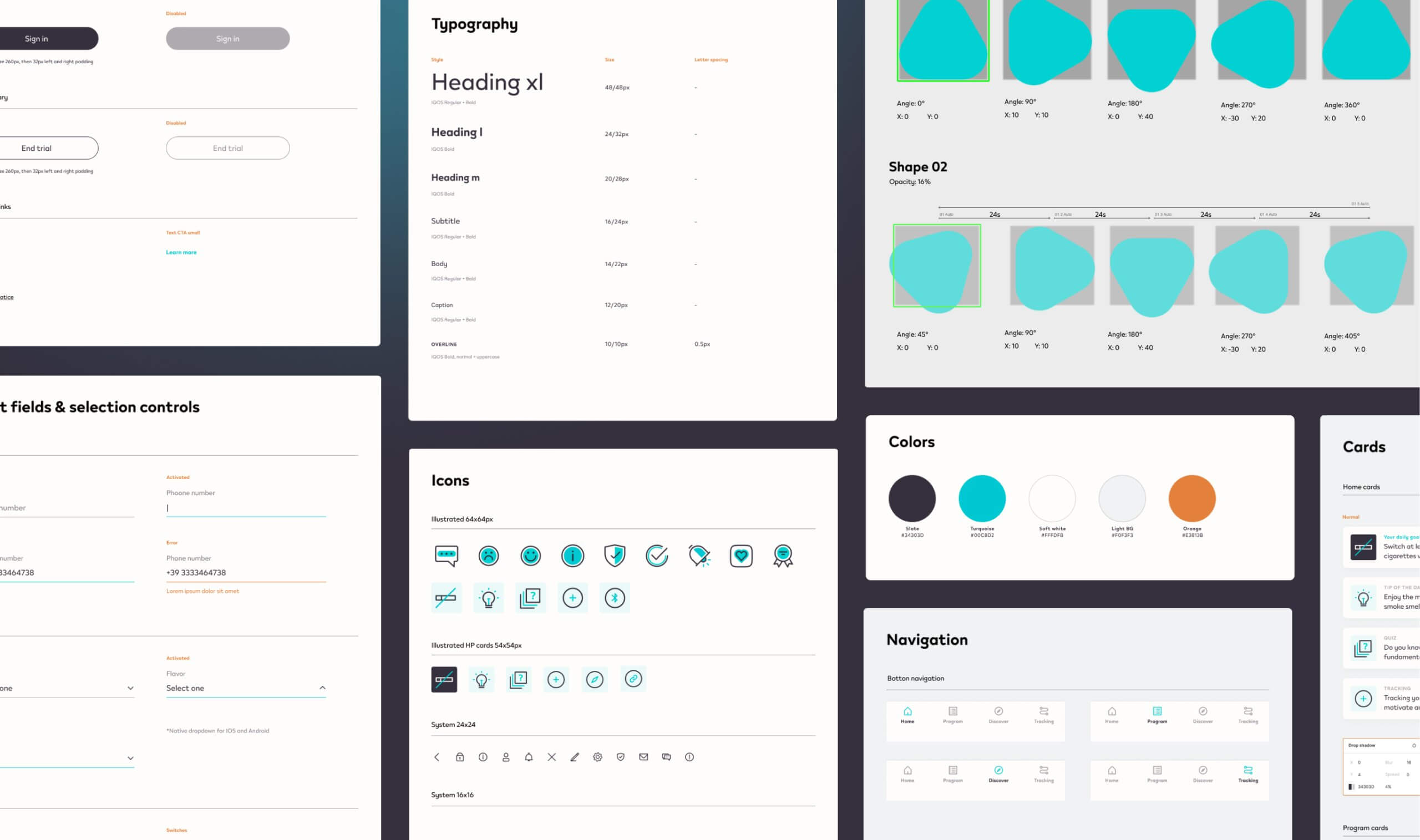
UI Library
A sample of the UI kit we developed for the client.
The library encompasses a wide array of elements including buttons, icons, typography, and other essential components for a unified and engaging user experience.
We achieved this outcome by blending various skills, including scientists, data scientists, designers, and developers, all working together in harmony.